5 Spring color palettes for the next design in your home! Fresh and beautiful!
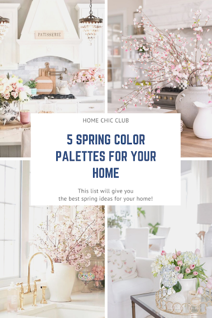
Spring is finally here and it couldn’t have arrived soon enough! The following 5 color palettes will show several spring color motifs, all inspiring and beautiful. Hopefully this post will help you`ll jump into spring with fresh color ideas for your home.
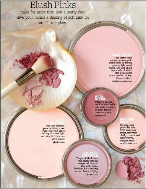
1. Blush Pinks
People often thinks this is a feminine color, so it fits just in a girls room, but, used correctly, this color can bring so much to your home. Personally, I was never a huge fun of pink, but I`m converted now. I love to use it in a details, like pillows or vases throughout my home. Since most of my home is white, combined with a pale green, chalky creams or some shades of blue, this color brings freshness and softness to any space. Don`t be afraid to try it on, you`ll love it.
2. Light Green
You can never go wrong with a light green in the spring. Just like a nature, dress up your home with this lovely shades. You can combine it with almost any color you already have in your space. Sprinkle it on the sofa with pillows and throws, put a beautiful flowers in a sage green vase, add a few green pots on a kitchen shelves and enjoy a feeling of freshness. Also, green paint is continuing to gain popularity and I don’t see it becoming dated anytime soon.
3. Yellow
When I think of first signs of spring, I think Forsythia! It show us it`s beautiful yellow flowers early, sometimes even before we actually feels spring is coming. Yellow is such a happy color, color of sun and life and I can`t think of any other color that captures spring better. I must say, I don`t really use it that much in my home, because it can also be very harsh, but if I choose to use it, I will use soft, buttery yellow to make my home look and feel delicious!
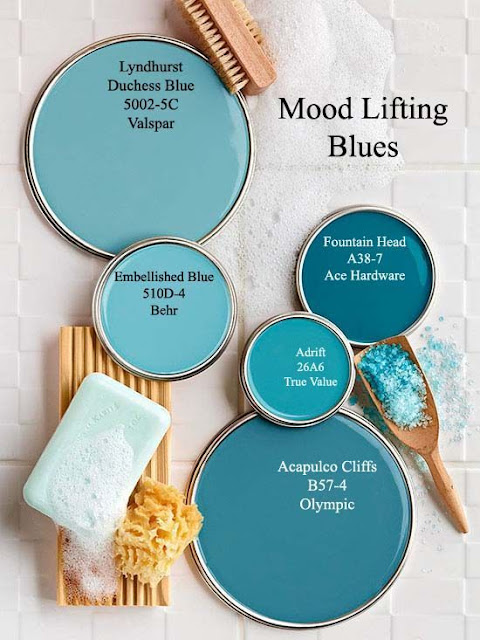
4. Mood Lifting Blues
Blue is the color of the ocean and the sky; it symbolizes serenity, stability, inspiration, wisdom or health. It can be a calming color, and symbolize reliability. So, it`s basically perfect in any season, but I love it in spring. It feels fresh and clean, like a clear blue sky, makes me calm and happy. Best combo for me is with white, but also very lovely with yellow and some shades of pink.
5. Oranges and Corals
I know, bright colors can be intimidating, especially for the neutral lovers like me. Orange color symbolizes energy, vitality, cheer, excitement, adventure, warmth, and good health. If you don`t like it, try softer shades of peachy orange or coral and you will be surprised how nice they can be, especially with all white houses, like mine. If you didn`t know, pink-orange hue is very popular this year, since the Pantone`s Spring 2021 Color is Burnt Coral. So, stay in trend and enjoy this lovely hue that evokes a sense of familiarity and comfort.
All color are inspired by floral hues and nature and they`re filled with all the springtime palette inspiration you need to make your home feel fresh and beautiful.


No comments:
Post a Comment